
Styling a Winter Story: Behind the Scenes of Fort Berens’ Seasonal Wine Session
- Deanna Dunham
- Nov 20, 2025
- 3 min read

A creative journey inspired by Lillooet’s landscape, history, and the warmth of shared winter moments.
When I design a seasonal set for a winery, my goal is never just to “decorate.”I’m building a visual story — a small, intentional world — that reflects the heart of the brand and the land it comes from.
For Fort Berens, nestled in the historic region of Lillooet, that story is rich, textured, and deeply Canadian. Their wines carry a sense of place: rugged landscape, pioneering spirit, and a connection to the land that feels both grounded and expansive.
So for this winter session, I wanted every prop, every layer, and every piece of styling to feel like it belonged to Fort Berens, Lillooet, and the winter season itself.
Here’s how this winter-themed story came to life.
Vintage Books: A Quiet Tribute to Canadian History
Among my styling props, I keep a few treasured vintage books that I bring out only when the story calls for them.
For this session, I chose two meaningful titles:
📘 Scenic Wonders of Canada
📗 Explore Canada

These books offered more than visual charm — they carried symbolic weight.
Lillooet is a place woven into Canada’s historical fabric:from the Cariboo Gold Rush to its legacy as one of the oldest continuously inhabited regions in the country.
The books added layers of:
Heritage — a nod to the deep roots of the region
Exploration — reflecting the pioneering spirit behind Fort Berens
Place — grounding the imagery in Canadian identity
They anchored the set in authenticity and meaningful storytelling.
Lanterns: Guiding Light Through Winter
Lanterns were chosen not just for seasonal atmosphere, but for their symbolism:
warmth through winter
guidance
welcome
community
In imagery, lanterns invite the viewer into the scene, echoing Fort Berens’ friendly, community-centered spirit. They create a soft glow that feels like hospitality — a light in the long winter evenings of the Fraser Canyon.
Eucalyptus & Winter Greenery: Nature’s Calm, Courtesy of Bella Vita Flowers
The greenery in this set came from Bella Vita Flowers in Summerland, a partnership I am forever grateful for.
Their eucalyptus and lush winter swag added:
natural texture
grounded calm
winter resilience
freshness against the warm tones of the books and lanterns

Bella Vita’s artistry consistently brings a sense of elevated authenticity to my styling.Their greenery blended seamlessly into the winter narrative, echoing the harmony between vineyard life and seasonal stillness.
Stars: A Touch of Magic & Direction
The star lights offered a gentle hint of seasonal magic while maintaining the refined aesthetic needed for commercial wine imagery.
Symbolically, they brought:
direction
exploration
hope
guidance through winter
Visually, they added warmth and soft diffusion to balance the greenery and vintage textures.

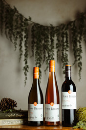
Colour Grading: A Subtle Tribute to Fort Berens’ Iconic Emblem
One of the most intentional elements of this session was the colour grading.
Fort Berens’ emblem features a signature warm orange — a tone that symbolizes:
the valley sun
energy and vibrancy
warmth and welcome
To honour this, I enhanced:
the amber tones in the wine
the warm glow in the lantern reflections
the soft golden-orange hue in the glass stems
This subtle grading ties the entire gallery back to their brand. It’s not loud, but it’s unmistakably Fort Berens — their identity woven into the light itself.
Bringing It All Together
Every styling choice had purpose:
Vintage books honored Canadian history and Lillooet’s heritage
Lanterns symbolized warmth and winter welcome
Greenery from Bella Vita Flowers added natural calm and seasonal texture
Stars offered direction and quiet winter magic
Colour grading echoed the Fort Berens emblem for cohesive branding
The result is a winter scene that feels warm, deep, and deeply rooted in place.A thoughtful blend of history, nature, and brand identity — styled with intention and heart.
This session doesn’t just showcase the wine.
It showcases where it comes from, who it belongs to, and the story it carries.
Here is the completed project.


Comments